Designing for Confidence
Rethinking BIOTRONIK's Cardiac Remote Assistant
My Role: Project Manager & Lead Interviewer
Tools & Skills: User Interviews, Usability Testing, Diary Studies, Journey Mapping, Participant Recruitment, Figma, Onshape
Context: Human Factors Senior Capstone at Tufts University, in partnership with BIOTRONIK | Spring 2026 | Three-person team

Existing Device—shown for context
Note: This project was completed in collaboration with BIOTRONIK. The physical designs and product concepts are confidential, so this case study focuses on our research methods, findings, and how they informed product decisions.
The Challenge: How might we redesign the Remote Assistant for the BIOTRONIK Internal Cardiac Monitor so patients can confidently mark symptomatic cardiac events when they happen?
Note: This project was completed in collaboration with BIOTRONIK. The physical designs and product concepts are confidential, so this case study focuses on our research methods, findings, and how they informed product decisions.
The Challenge: How might we redesign the Remote Assistant for the BIOTRONIK Internal Cardiac Monitor so patients can confidently mark symptomatic cardiac events when they happen?
The BIOTRONIK Remote Assistant allows patients with an implantable cardiac monitor (ICM) to manually mark symptomatic cardiac events. Because symptoms can occur unpredictably, patients need to keep the device nearby and be able to operate it confidently, even under stress.
Our team partnered with BIOTRONIK to investigate opportunities to improve the Remote Assistant's physical and interaction experience, with particular consideration for older adults. Through exploratory interviews, diary studies, and iterative usability testing, we examined two central challenges: portability (ensuring the device is accessible throughout daily life) and clarity under stress (helping patients understand device feedback, confirm successful interactions, and recover from errors).
Our research informed recommendations for the device's form factor, interface feedback, and patient support.
Our Process
Secondary Research & Exploratory Interviews
We began by familiarizing ourselves with BIOTRONIK's existing Remote Assistant, the broader cardiac monitoring experience, and comparable products from other medical device companies.
Our competitive research explored trends in connectivity, portability, and interaction design. We identified opportunities to simplify device interactions, improve feedback, and make the product more convenient for everyday use.
To understand the experience beyond the technology, we also conducted exploratory interviews with patients and healthcare stakeholders, including clinical professionals and a field representative.
I took an active role in recruiting participants through personal outreach and postings on Facebook, and served as the primary interviewer throughout our studies. I guided conversations to better understand participants' experiences, everyday routines, frustrations, and expectations.
Together, our team identified three recurring themes:
Carriability: A device that is inconvenient to carry may not be nearby when patients experience symptoms.
Clarity: Patients need feedback that is quick and easy to interpret, particularly when experiencing symptoms.
Error Recovery: When something goes wrong, patients need understandable guidance rather than having to immediately rely on a clinician for assistance.
These findings reinforced that a successful device experience must extend beyond its primary interaction to include preparation, reassurance, and troubleshooting.
Key Decisions
1) Prioritizing simplicity over additional features. Our diary study challenged assumptions about the need for wearable components and device-location features. Findings suggested that participants could comfortably manage smaller devices without relying on these additions, helping us refine our product priorities.
2) Separating device status from medical status. During usability testing, participants sometimes interpreted failure feedback as an indication of a heart problem rather than an unsuccessful device interaction. This finding led us to prioritize neutral, unambiguous feedback that clearly communicated the device's status.
3) Making troubleshooting part of the product experience. Participants often wanted to retry unsuccessful interactions but were unsure what to do differently. We translated this finding into a requirement for simple, readily accessible recovery guidance that would not depend on patients having separate instructions available.

Key Decisions
1) Prioritizing simplicity over additional features. Our diary study challenged assumptions about the need for wearable components and device-location features. Findings suggested that participants could comfortably manage smaller devices without relying on these additions, helping us refine our product priorities.
2) Separating device status from medical status. During usability testing, participants sometimes interpreted failure feedback as an indication of a heart problem rather than an unsuccessful device interaction. This finding led us to prioritize neutral, unambiguous feedback that clearly communicated the device's status.
3) Making troubleshooting part of the product experience. Participants often wanted to retry unsuccessful interactions but were unsure what to do differently. We translated this finding into a requirement for simple, readily accessible recovery guidance that would not depend on patients having separate instructions available.


Patient Journey Mapping
To better understand how these challenges appeared throughout the experience, our team collaboratively developed a patient journey map.
We examined what happens when a patient experiences symptoms: locating the Remote Assistant, positioning it, initiating the interaction, waiting for feedback, and interpreting the result.
This exercise helped identify five moments where patients could encounter uncertainty:
Locate: Is the device nearby when symptoms occur?
Place: Does the patient know how to position it correctly?
Wait: Can the patient understand what is happening?
Recover: If the interaction fails, does the patient know what to do next?
Finish: Does the patient know whether the event was successfully marked?
Mapping these moments helped us recognize that patients needed support throughout the interaction, not simply a clear way to initiate it.
We translated these observations into three guiding experience principles: communicate progress, confirm completion, and support recovery.
Our Process
Secondary Research & Exploratory Interviews
We began by familiarizing ourselves with BIOTRONIK's existing Remote Assistant, the broader cardiac monitoring experience, and comparable products from other medical device companies.
Our competitive research explored trends in connectivity, portability, and interaction design. We identified opportunities to simplify device interactions, improve feedback, and make the product more convenient for everyday use.
To understand the experience beyond the technology, we also conducted exploratory interviews with patients and healthcare stakeholders, including clinical professionals and a field representative.
I took an active role in recruiting participants through personal outreach and postings on Facebook, and served as the primary interviewer throughout our studies. I guided conversations to better understand participants' experiences, everyday routines, frustrations, and expectations.
Together, our team identified three recurring themes:
Carriability: A device that is inconvenient to carry may not be nearby when patients experience symptoms.
Clarity: Patients need feedback that is quick and easy to interpret, particularly when experiencing symptoms.
Error Recovery: When something goes wrong, patients need understandable guidance rather than having to immediately rely on a clinician for assistance.
These findings reinforced that a successful device experience must extend beyond its primary interaction to include preparation, reassurance, and troubleshooting.

Diary Study: Understanding Everyday Carrying Behavior
3 participants | Ages 55+ | 4 days | 3 form factors
Our next question was whether a smaller, more portable Remote Assistant would fit naturally into patients' daily routines.
We collaboratively designed and conducted a four-day diary study with three participants aged 55 and older, examining how different physical form factors affected carrying habits and device accessibility.
The study investigated whether participants kept their devices nearby, how quickly they could locate them, and whether additional wearable features improved their experience.
What We Learned:
Participants were comfortable with the smaller device sizes.
All three participants located their devices in under 120 seconds.
Wearable features were rarely, if ever, used.
While the small sample limited how broadly we could generalize these findings, the study challenged some of our assumptions about which features were necessary.
Rather than recommending additional locating functionality or prominent wearable features, we determined that these should not be immediate priorities without further evidence of need.
How This Informed Our Direction:
The diary study suggested that portability could be improved without introducing unnecessary functionality. This helped us refine our focus toward making everyday use more convenient while continuing to investigate the interaction challenges identified in earlier research.

Usability Testing: Understanding Feedback and Confidence
Our exploratory research suggested that patients needed clearer device feedback, but we still needed to understand which types of feedback users could interpret most easily.
We conducted two rounds of iterative interaction testing, using Figma-based prototypes to evaluate how participants responded to successful and unsuccessful interactions.
I served as the primary interviewer throughout the studies, guiding participants through tasks and asking follow-up questions to understand their interpretations, expectations, and decision-making. Our team collaborated on testing, reviewing observations, and using the findings to inform subsequent iterations.
We focused on three research questions:
Could participants correctly interpret successful and unsuccessful interactions?
How confident were participants that their action had worked?
If an interaction failed, did participants understand what to do next?
We evaluated these questions through comprehension measures, confidence ratings, and qualitative observations.

Usability Testing: Round 1
9 participants | Comparative interaction evaluation
In our first study, we compared how participants responded to different combinations of interface feedback.
We wanted to understand not only whether participants recognized success and failure, but also what specific cues they relied on to make those judgments.
Several findings challenged our initial expectations.
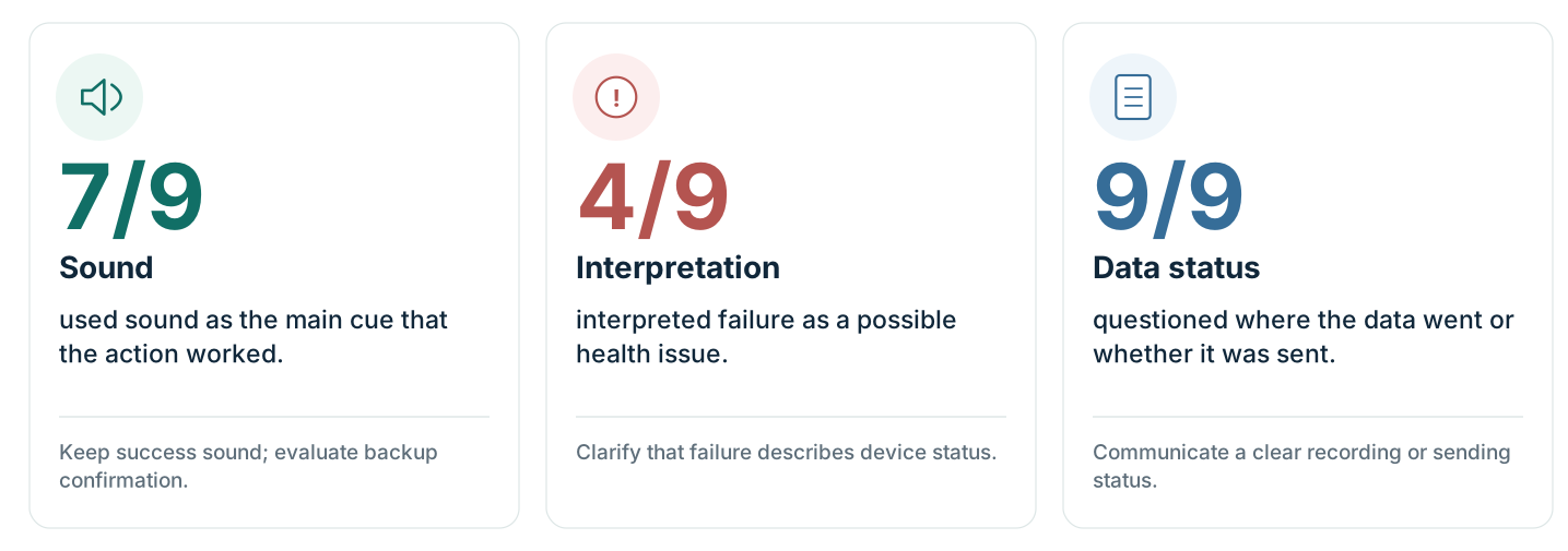
Finding 1: Sound was a primary source of confirmation.
Seven of nine participants used auditory feedback as their main indication that an action had worked. Sound helped participants recognize progress and completion, demonstrating that the interaction could not depend exclusively on visual feedback.
However, more than half of the participants also expressed displeasure with the failure sound, highlighting the importance of how auditory cues communicate meaning.
Finding 2: Failure feedback could be mistaken for a medical problem.
Four of nine participants interpreted an unsuccessful interaction as potentially indicating something wrong with their heart, rather than a failure of the device to complete the intended action.
This was one of our most important findings. An interface intended to reassure patients could inadvertently create additional anxiety when its feedback was ambiguous.
It became clear that we needed to distinguish the status of the device from the health status of the patient.
Finding 3: Participants were uncertain about what happened after marking an event.
All nine participants questioned where their information went or whether it had been sent.
This revealed that completing an interaction did not necessarily mean participants felt confident that they had accomplished their goal.
Patients needed clearer communication about the status of their interaction and what would happen next.
How This Informed Our Direction:
We used these findings to prioritize understandable visual cues, less ambiguous auditory feedback, explicit status communication, and instructions for recovering from unsuccessful interactions.
Usability Testing: Round 2
Following our first round of testing, we iterated on our interaction approach and evaluated revised feedback patterns in a second usability study.
Our goal was to determine whether the changes improved comprehension and confidence while identifying remaining challenges related to feedback and error recovery.
We compared participants' understanding of success and failure states, their confidence ratings, and their behavior during the interaction.
Finding 1: Clearer feedback improved participants' comprehension and confidence.
In the second study, the higher-performing feedback configuration achieved an average confidence rating of 4.25 out of 5, compared with 3.17 for the alternative configuration.
The same configuration also produced the highest comprehension results for success and failure conditions within the second study.
These results helped us identify more effective approaches to communicating system status, although further testing would be required with the intended patient population.
Finding 2: Participants did not always look at the device.
Forty percent of participants did not look at the interface during use, relying entirely on auditory cues.
This reinforced our earlier findings that visual communication alone was insufficient. We recommended feedback that could be understood without requiring continuous visual attention.
Finding 3: Patients needed actionable error-recovery instructions.
Eighty percent of participants described retrying or wanting to retry an unsuccessful interaction, but were unsure what to change.
This indicated that communicating failure alone was not enough. An effective interaction also needed to explain how the patient could recover.
As one participant explained:
"I would use the troubleshooting guide if I had one before calling a doctor."
How This Informed Our Direction:
These findings reinforced the importance of multimodal feedback and led us to prioritize simple, accessible troubleshooting guidance.
Rather than relying on users to interpret ambiguous signals or remember separate instructions, we recommended that the product experience make next steps immediately understandable and readily available.

Comparison of participant comprehension and average confidence ratings across two rounds of usability testing. Results are compared within each study, rather than as a controlled before-and-after comparison.
Translating Research into Design Requirements
Across our exploratory interviews, diary study, and two rounds of usability testing, we continuously reconsidered our priorities based on what participants actually experienced.
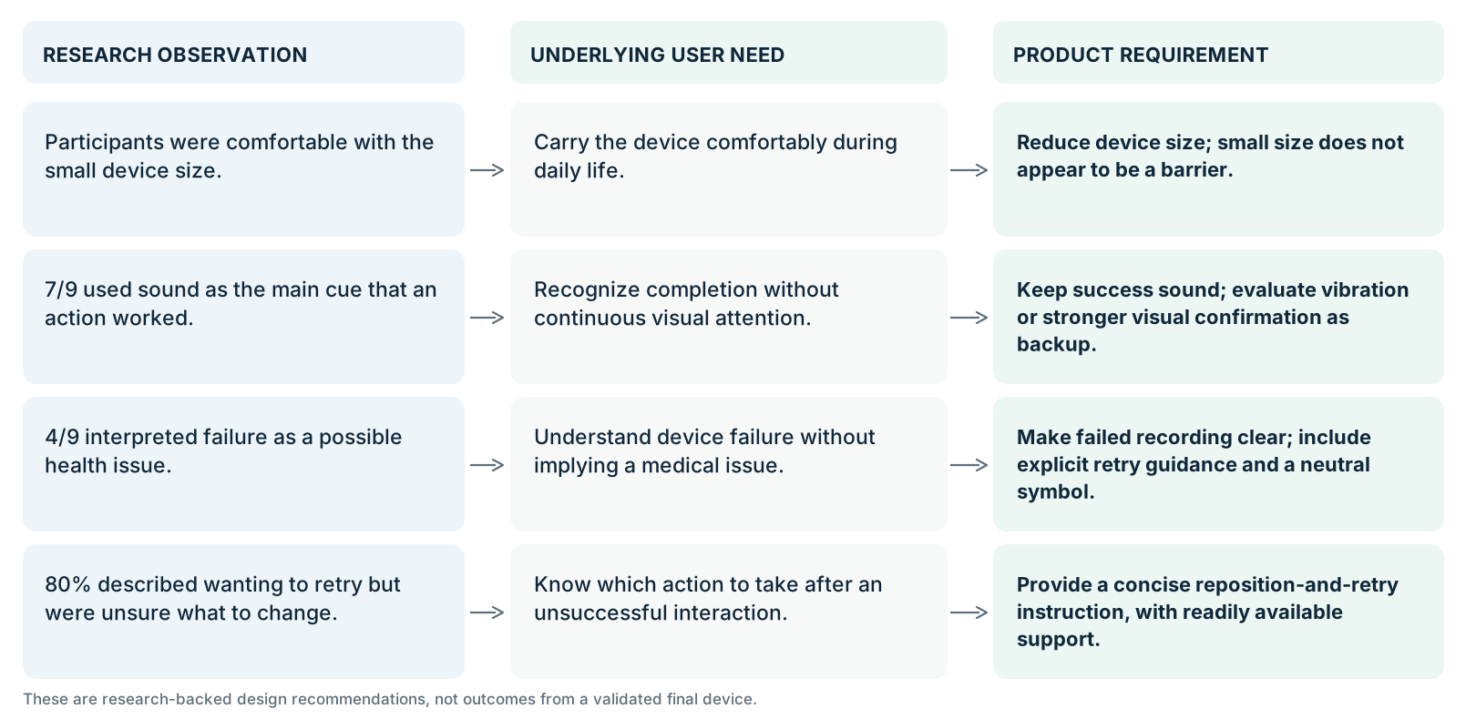
Our team consolidated these findings into three guiding requirements.
1. Clear, Unambiguous Communication
Patients should be able to understand the state of the interaction without confusing device feedback with a medical outcome.
Our testing demonstrated the importance of clear status information, neutral symbols, and explicit confirmation of completion.
2. Multimodal Feedback
Patients may not always be looking at the device when they use it.
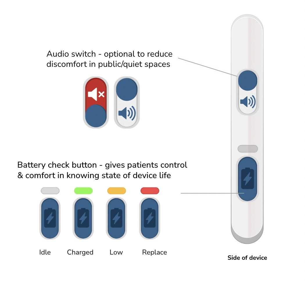
We recommended that important information be communicated through complementary modes of feedback, including visual and auditory signals, with tactile feedback identified as an area for future validation.
3. Accessible Error Recovery
Patients need support when an interaction does not work as expected.
We recommended concise troubleshooting instructions that clearly communicate what to do next and remain accessible with the device rather than depending on separate materials that might not be available during an emergency or stressful moment.
These recommendations highlighted a central design tradeoff: the Remote Assistant needed to be small and convenient enough for everyday use while remaining clear and accessible for patients experiencing symptoms.
Next Steps…
Our project concluded with research-backed design recommendations for BIOTRONIK and opportunities for further validation.
Although our studies produced valuable insights, we also recognized important limitations.
Our diary study included only three participants aged 55 and older. Recruiting participants from the intended patient population was challenging, and the interaction studies relied on convenience sampling with a younger demographic. As a result, the findings would need additional validation with older adults and cardiac monitoring patients.
Additionally, the Figma prototypes were presented on an iPhone, which had a larger screen than the intended device and could not fully reproduce tactile feedback, physical controls, or the final interaction scale.
We recommended four directions for future research:
Validate with older adults: Evaluate readability, comprehension, grip, and interaction confidence with participants representative of the intended patient population.
Test integrated multimodal feedback: Examine how visual, auditory, and tactile cues work together using physical prototypes.
Evaluate troubleshooting effectiveness: Determine whether patients can independently understand and act on recovery instructions during unsuccessful interactions.
Refine auditory feedback: Test neutral, non-alarming sounds that clearly communicate device status without implying physiological outcomes.
We also identified an opportunity for future cross-cultural research into how symbols and interface feedback may be interpreted by patients in different regions.
Project Takeaways
This project reinforced the importance of letting research challenge initial assumptions rather than using testing solely to validate design ideas.
We began by investigating the physical accessibility of the Remote Assistant, but our research demonstrated that having the device nearby was only one part of a successful patient experience. Patients also needed to understand what it was communicating and know how to respond when something went wrong.
Serving as the primary interviewer was particularly valuable because it allowed me to hear participants' expectations and interpretations firsthand, including moments where their understanding differed from what the interface was intended to communicate.
Working through exploratory research, longitudinal observation, iterative usability testing, and research synthesis helped me better understand how user insights can inform product decisions.
Ultimately, the project demonstrated that designing for accessibility and confidence means considering not only whether someone can complete an action, but also whether they understand what happened—and what to do next.


Our Process
Secondary Research & Exploratory Interviews
We began by familiarizing ourselves with BIOTRONIK's existing Remote Assistant, the broader cardiac monitoring experience, and comparable products from other medical device companies.
Our competitive research explored trends in connectivity, portability, and interaction design. We identified opportunities to simplify device interactions, improve feedback, and make the product more convenient for everyday use.
To understand the experience beyond the technology, we also conducted exploratory interviews with patients and healthcare stakeholders, including clinical professionals and a field representative.
I took an active role in recruiting participants through personal outreach and postings on Facebook, and served as the primary interviewer throughout our studies. I guided conversations to better understand participants' experiences, everyday routines, frustrations, and expectations.
Together, our team identified three recurring themes:
Carriability: A device that is inconvenient to carry may not be nearby when patients experience symptoms.
Clarity: Patients need feedback that is quick and easy to interpret, particularly when experiencing symptoms.
Error Recovery: When something goes wrong, patients need understandable guidance rather than having to immediately rely on a clinician for assistance.
These findings reinforced that a successful device experience must extend beyond its primary interaction to include preparation, reassurance, and troubleshooting.
Key Decisions
1) Prioritizing simplicity over additional features. Our diary study challenged assumptions about the need for wearable components and device-location features. Findings suggested that participants could comfortably manage smaller devices without relying on these additions, helping us refine our product priorities.
2) Separating device status from medical status. During usability testing, participants sometimes interpreted failure feedback as an indication of a heart problem rather than an unsuccessful device interaction. This finding led us to prioritize neutral, unambiguous feedback that clearly communicated the device's status.
3) Making troubleshooting part of the product experience. Participants often wanted to retry unsuccessful interactions but were unsure what to do differently. We translated this finding into a requirement for simple, readily accessible recovery guidance that would not depend on patients having separate instructions available.
Note: This project was completed in collaboration with BIOTRONIK. The physical designs and product concepts are confidential, so this case study focuses on our research methods, findings, and how they informed product decisions.
The Challenge: How might we redesign the Remote Assistant for the BIOTRONIK Internal Cardiac Monitor so patients can confidently mark symptomatic cardiac events when they happen?
The BIOTRONIK Remote Assistant allows patients with an implantable cardiac monitor (ICM) to manually mark symptomatic cardiac events. Because symptoms can occur unpredictably, patients need to keep the device nearby and be able to operate it confidently, even under stress.
Our team partnered with BIOTRONIK to investigate opportunities to improve the Remote Assistant's physical and interaction experience, with particular consideration for older adults. Through exploratory interviews, diary studies, and iterative usability testing, we examined two central challenges: portability (ensuring the device is accessible throughout daily life) and clarity under stress (helping patients understand device feedback, confirm successful interactions, and recover from errors).
Our research informed recommendations for the device's form factor, interface feedback, and patient support.
Our Process
Secondary Research & Exploratory Interviews
We began by familiarizing ourselves with BIOTRONIK's existing Remote Assistant, the broader cardiac monitoring experience, and comparable products from other medical device companies.
Our competitive research explored trends in connectivity, portability, and interaction design. We identified opportunities to simplify device interactions, improve feedback, and make the product more convenient for everyday use.
To understand the experience beyond the technology, we also conducted exploratory interviews with patients and healthcare stakeholders, including clinical professionals and a field representative.
I took an active role in recruiting participants through personal outreach and postings on Facebook, and served as the primary interviewer throughout our studies. I guided conversations to better understand participants' experiences, everyday routines, frustrations, and expectations.
Together, our team identified three recurring themes:
Carriability: A device that is inconvenient to carry may not be nearby when patients experience symptoms.
Clarity: Patients need feedback that is quick and easy to interpret, particularly when experiencing symptoms.
Error Recovery: When something goes wrong, patients need understandable guidance rather than having to immediately rely on a clinician for assistance.
These findings reinforced that a successful device experience must extend beyond its primary interaction to include preparation, reassurance, and troubleshooting.
Patient Journey Mapping
To better understand how these challenges appeared throughout the experience, our team collaboratively developed a patient journey map.
We examined what happens when a patient experiences symptoms: locating the Remote Assistant, positioning it, initiating the interaction, waiting for feedback, and interpreting the result.
This exercise helped identify five moments where patients could encounter uncertainty:
Locate: Is the device nearby when symptoms occur?
Place: Does the patient know how to position it correctly?
Wait: Can the patient understand what is happening?
Recover: If the interaction fails, does the patient know what to do next?
Finish: Does the patient know whether the event was successfully marked?
Mapping these moments helped us recognize that patients needed support throughout the interaction, not simply a clear way to initiate it.
We translated these observations into three guiding experience principles: communicate progress, confirm completion, and support recovery.
Diary Study: Understanding Everyday Carrying Behavior
3 participants | Ages 55+ | 4 days | 3 form factors
Our next question was whether a smaller, more portable Remote Assistant would fit naturally into patients' daily routines.
We collaboratively designed and conducted a four-day diary study with three participants aged 55 and older, examining how different physical form factors affected carrying habits and device accessibility.
The study investigated whether participants kept their devices nearby, how quickly they could locate them, and whether additional wearable features improved their experience.
What We Learned:
Participants were comfortable with the smaller device sizes.
All three participants located their devices in under 120 seconds.
Wearable features were rarely, if ever, used.
While the small sample limited how broadly we could generalize these findings, the study challenged some of our assumptions about which features were necessary.
Rather than recommending additional locating functionality or prominent wearable features, we determined that these should not be immediate priorities without further evidence of need.
How This Informed Our Direction:
The diary study suggested that portability could be improved without introducing unnecessary functionality. This helped us refine our focus toward making everyday use more convenient while continuing to investigate the interaction challenges identified in earlier research.
Diary Study: Understanding Everyday Carrying Behavior
3 participants | Ages 55+ | 4 days | 3 form factors
Our next question was whether a smaller, more portable Remote Assistant would fit naturally into patients' daily routines.
We collaboratively designed and conducted a four-day diary study with three participants aged 55 and older, examining how different physical form factors affected carrying habits and device accessibility.
The study investigated whether participants kept their devices nearby, how quickly they could locate them, and whether additional wearable features improved their experience.
What We Learned:
Participants were comfortable with the smaller device sizes.
All three participants located their devices in under 120 seconds.
Wearable features were rarely, if ever, used.
While the small sample limited how broadly we could generalize these findings, the study challenged some of our assumptions about which features were necessary.
Rather than recommending additional locating functionality or prominent wearable features, we determined that these should not be immediate priorities without further evidence of need.
How This Informed Our Direction:
The diary study suggested that portability could be improved without introducing unnecessary functionality. This helped us refine our focus toward making everyday use more convenient while continuing to investigate the interaction challenges identified in earlier research.
Key Decisions
1) Prioritizing simplicity over additional features. Our diary study challenged assumptions about the need for wearable components and device-location features. Findings suggested that participants could comfortably manage smaller devices without relying on these additions, helping us refine our product priorities.
2) Separating device status from medical status. During usability testing, participants sometimes interpreted failure feedback as an indication of a heart problem rather than an unsuccessful device interaction. This finding led us to prioritize neutral, unambiguous feedback that clearly communicated the device's status.
3) Making troubleshooting part of the product experience. Participants often wanted to retry unsuccessful interactions but were unsure what to do differently. We translated this finding into a requirement for simple, readily accessible recovery guidance that would not depend on patients having separate instructions available.
Key Decisions
1) Prioritizing simplicity over additional features. Our diary study challenged assumptions about the need for wearable components and device-location features. Findings suggested that participants could comfortably manage smaller devices without relying on these additions, helping us refine our product priorities.
2) Separating device status from medical status. During usability testing, participants sometimes interpreted failure feedback as an indication of a heart problem rather than an unsuccessful device interaction. This finding led us to prioritize neutral, unambiguous feedback that clearly communicated the device's status.
3) Making troubleshooting part of the product experience. Participants often wanted to retry unsuccessful interactions but were unsure what to do differently. We translated this finding into a requirement for simple, readily accessible recovery guidance that would not depend on patients having separate instructions available.
Our Process
Secondary Research & Exploratory Interviews
We began by familiarizing ourselves with BIOTRONIK's existing Remote Assistant, the broader cardiac monitoring experience, and comparable products from other medical device companies.
Our competitive research explored trends in connectivity, portability, and interaction design. We identified opportunities to simplify device interactions, improve feedback, and make the product more convenient for everyday use.
To understand the experience beyond the technology, we also conducted exploratory interviews with patients and healthcare stakeholders, including clinical professionals and a field representative.
I took an active role in recruiting participants through personal outreach and postings on Facebook, and served as the primary interviewer throughout our studies. I guided conversations to better understand participants' experiences, everyday routines, frustrations, and expectations.
Together, our team identified three recurring themes:
Carriability: A device that is inconvenient to carry may not be nearby when patients experience symptoms.
Clarity: Patients need feedback that is quick and easy to interpret, particularly when experiencing symptoms.
Error Recovery: When something goes wrong, patients need understandable guidance rather than having to immediately rely on a clinician for assistance.
These findings reinforced that a successful device experience must extend beyond its primary interaction to include preparation, reassurance, and troubleshooting.
Our Process
Secondary Research & Exploratory Interviews
We began by familiarizing ourselves with BIOTRONIK's existing Remote Assistant, the broader cardiac monitoring experience, and comparable products from other medical device companies.
Our competitive research explored trends in connectivity, portability, and interaction design. We identified opportunities to simplify device interactions, improve feedback, and make the product more convenient for everyday use.
To understand the experience beyond the technology, we also conducted exploratory interviews with patients and healthcare stakeholders, including clinical professionals and a field representative.
I took an active role in recruiting participants through personal outreach and postings on Facebook, and served as the primary interviewer throughout our studies. I guided conversations to better understand participants' experiences, everyday routines, frustrations, and expectations.
Together, our team identified three recurring themes:
Carriability: A device that is inconvenient to carry may not be nearby when patients experience symptoms.
Clarity: Patients need feedback that is quick and easy to interpret, particularly when experiencing symptoms.
Error Recovery: When something goes wrong, patients need understandable guidance rather than having to immediately rely on a clinician for assistance.
These findings reinforced that a successful device experience must extend beyond its primary interaction to include preparation, reassurance, and troubleshooting.
Patient Journey Mapping
To better understand how these challenges appeared throughout the experience, our team collaboratively developed a patient journey map.
We examined what happens when a patient experiences symptoms: locating the Remote Assistant, positioning it, initiating the interaction, waiting for feedback, and interpreting the result.
This exercise helped identify five moments where patients could encounter uncertainty:
Locate: Is the device nearby when symptoms occur?
Place: Does the patient know how to position it correctly?
Wait: Can the patient understand what is happening?
Recover: If the interaction fails, does the patient know what to do next?
Finish: Does the patient know whether the event was successfully marked?
Mapping these moments helped us recognize that patients needed support throughout the interaction, not simply a clear way to initiate it.
We translated these observations into three guiding experience principles: communicate progress, confirm completion, and support recovery.
Diary Study: Understanding Everyday Carrying Behavior
3 participants | Ages 55+ | 4 days | 3 form factors
Our next question was whether a smaller, more portable Remote Assistant would fit naturally into patients' daily routines.
We collaboratively designed and conducted a four-day diary study with three participants aged 55 and older, examining how different physical form factors affected carrying habits and device accessibility.
The study investigated whether participants kept their devices nearby, how quickly they could locate them, and whether additional wearable features improved their experience.
What We Learned:
Participants were comfortable with the smaller device sizes.
All three participants located their devices in under 120 seconds.
Wearable features were rarely, if ever, used.
While the small sample limited how broadly we could generalize these findings, the study challenged some of our assumptions about which features were necessary.
Rather than recommending additional locating functionality or prominent wearable features, we determined that these should not be immediate priorities without further evidence of need.
How This Informed Our Direction:
The diary study suggested that portability could be improved without introducing unnecessary functionality. This helped us refine our focus toward making everyday use more convenient while continuing to investigate the interaction challenges identified in earlier research.
Usability Testing: Understanding Feedback and Confidence
Our exploratory research suggested that patients needed clearer device feedback, but we still needed to understand which types of feedback users could interpret most easily.
We conducted two rounds of iterative interaction testing, using Figma-based prototypes to evaluate how participants responded to successful and unsuccessful interactions.
I served as the primary interviewer throughout the studies, guiding participants through tasks and asking follow-up questions to understand their interpretations, expectations, and decision-making. Our team collaborated on testing, reviewing observations, and using the findings to inform subsequent iterations.
We focused on three research questions:
Could participants correctly interpret successful and unsuccessful interactions?
How confident were participants that their action had worked?
If an interaction failed, did participants understand what to do next?
We evaluated these questions through comprehension measures, confidence ratings, and qualitative observations.
Usability Testing: Round 1
9 participants | Comparative interaction evaluation
In our first study, we compared how participants responded to different combinations of interface feedback.
We wanted to understand not only whether participants recognized success and failure, but also what specific cues they relied on to make those judgments.
Several findings challenged our initial expectations.
Finding 1: Sound was a primary source of confirmation.
Seven of nine participants used auditory feedback as their main indication that an action had worked. Sound helped participants recognize progress and completion, demonstrating that the interaction could not depend exclusively on visual feedback.
However, more than half of the participants also expressed displeasure with the failure sound, highlighting the importance of how auditory cues communicate meaning.
Finding 2: Failure feedback could be mistaken for a medical problem.
Four of nine participants interpreted an unsuccessful interaction as potentially indicating something wrong with their heart, rather than a failure of the device to complete the intended action.
This was one of our most important findings. An interface intended to reassure patients could inadvertently create additional anxiety when its feedback was ambiguous.
It became clear that we needed to distinguish the status of the device from the health status of the patient.
Finding 3: Participants were uncertain about what happened after marking an event.
All nine participants questioned where their information went or whether it had been sent.
This revealed that completing an interaction did not necessarily mean participants felt confident that they had accomplished their goal.
Patients needed clearer communication about the status of their interaction and what would happen next.
How This Informed Our Direction:
We used these findings to prioritize understandable visual cues, less ambiguous auditory feedback, explicit status communication, and instructions for recovering from unsuccessful interactions.
Usability Testing: Round 2
Following our first round of testing, we iterated on our interaction approach and evaluated revised feedback patterns in a second usability study.
Our goal was to determine whether the changes improved comprehension and confidence while identifying remaining challenges related to feedback and error recovery.
We compared participants' understanding of success and failure states, their confidence ratings, and their behavior during the interaction.
Finding 1: Clearer feedback improved participants' comprehension and confidence.
In the second study, the higher-performing feedback configuration achieved an average confidence rating of 4.25 out of 5, compared with 3.17 for the alternative configuration.
The same configuration also produced the highest comprehension results for success and failure conditions within the second study.
These results helped us identify more effective approaches to communicating system status, although further testing would be required with the intended patient population.
Finding 2: Participants did not always look at the device.
Forty percent of participants did not look at the interface during use, relying entirely on auditory cues.
This reinforced our earlier findings that visual communication alone was insufficient. We recommended feedback that could be understood without requiring continuous visual attention.
Finding 3: Patients needed actionable error-recovery instructions.
Eighty percent of participants described retrying or wanting to retry an unsuccessful interaction, but were unsure what to change.
This indicated that communicating failure alone was not enough. An effective interaction also needed to explain how the patient could recover.
As one participant explained:
"I would use the troubleshooting guide if I had one before calling a doctor."
How This Informed Our Direction:
These findings reinforced the importance of multimodal feedback and led us to prioritize simple, accessible troubleshooting guidance.
Rather than relying on users to interpret ambiguous signals or remember separate instructions, we recommended that the product experience make next steps immediately understandable and readily available.
Usability Testing: Round 2
Following our first round of testing, we iterated on our interaction approach and evaluated revised feedback patterns in a second usability study.
Our goal was to determine whether the changes improved comprehension and confidence while identifying remaining challenges related to feedback and error recovery.
We compared participants' understanding of success and failure states, their confidence ratings, and their behavior during the interaction.
Finding 1: Clearer feedback improved participants' comprehension and confidence.
In the second study, the higher-performing feedback configuration achieved an average confidence rating of 4.25 out of 5, compared with 3.17 for the alternative configuration.
The same configuration also produced the highest comprehension results for success and failure conditions within the second study.
These results helped us identify more effective approaches to communicating system status, although further testing would be required with the intended patient population.
Finding 2: Participants did not always look at the device.
Forty percent of participants did not look at the interface during use, relying entirely on auditory cues.
This reinforced our earlier findings that visual communication alone was insufficient. We recommended feedback that could be understood without requiring continuous visual attention.
Finding 3: Patients needed actionable error-recovery instructions.
Eighty percent of participants described retrying or wanting to retry an unsuccessful interaction, but were unsure what to change.
This indicated that communicating failure alone was not enough. An effective interaction also needed to explain how the patient could recover.
As one participant explained:
"I would use the troubleshooting guide if I had one before calling a doctor."
How This Informed Our Direction:
These findings reinforced the importance of multimodal feedback and led us to prioritize simple, accessible troubleshooting guidance.
Rather than relying on users to interpret ambiguous signals or remember separate instructions, we recommended that the product experience make next steps immediately understandable and readily available.
Comparison of participant comprehension and average confidence ratings across two rounds of usability testing. Results are compared within each study, rather than as a controlled before-and-after comparison.
Translating Research into Design Requirements
Across our exploratory interviews, diary study, and two rounds of usability testing, we continuously reconsidered our priorities based on what participants actually experienced.
Our team consolidated these findings into three guiding requirements.
1. Clear, Unambiguous Communication
Patients should be able to understand the state of the interaction without confusing device feedback with a medical outcome.
Our testing demonstrated the importance of clear status information, neutral symbols, and explicit confirmation of completion.
2. Multimodal Feedback
Patients may not always be looking at the device when they use it.
We recommended that important information be communicated through complementary modes of feedback, including visual and auditory signals, with tactile feedback identified as an area for future validation.
3. Accessible Error Recovery
Patients need support when an interaction does not work as expected.
We recommended concise troubleshooting instructions that clearly communicate what to do next and remain accessible with the device rather than depending on separate materials that might not be available during an emergency or stressful moment.
These recommendations highlighted a central design tradeoff: the Remote Assistant needed to be small and convenient enough for everyday use while remaining clear and accessible for patients experiencing symptoms.
Next Steps…
Our project concluded with research-backed design recommendations for BIOTRONIK and opportunities for further validation.
Although our studies produced valuable insights, we also recognized important limitations.
Our diary study included only three participants aged 55 and older. Recruiting participants from the intended patient population was challenging, and the interaction studies relied on convenience sampling with a younger demographic. As a result, the findings would need additional validation with older adults and cardiac monitoring patients.
Additionally, the Figma prototypes were presented on an iPhone, which had a larger screen than the intended device and could not fully reproduce tactile feedback, physical controls, or the final interaction scale.
We recommended four directions for future research:
Validate with older adults: Evaluate readability, comprehension, grip, and interaction confidence with participants representative of the intended patient population.
Test integrated multimodal feedback: Examine how visual, auditory, and tactile cues work together using physical prototypes.
Evaluate troubleshooting effectiveness: Determine whether patients can independently understand and act on recovery instructions during unsuccessful interactions.
Refine auditory feedback: Test neutral, non-alarming sounds that clearly communicate device status without implying physiological outcomes.
We also identified an opportunity for future cross-cultural research into how symbols and interface feedback may be interpreted by patients in different regions.
Project Takeaways
This project reinforced the importance of letting research challenge initial assumptions rather than using testing solely to validate design ideas.
We began by investigating the physical accessibility of the Remote Assistant, but our research demonstrated that having the device nearby was only one part of a successful patient experience. Patients also needed to understand what it was communicating and know how to respond when something went wrong.
Serving as the primary interviewer was particularly valuable because it allowed me to hear participants' expectations and interpretations firsthand, including moments where their understanding differed from what the interface was intended to communicate.
Working through exploratory research, longitudinal observation, iterative usability testing, and research synthesis helped me better understand how user insights can inform product decisions.
Ultimately, the project demonstrated that designing for accessibility and confidence means considering not only whether someone can complete an action, but also whether they understand what happened—and what to do next.